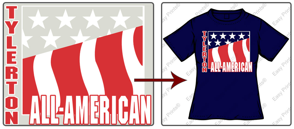
A clever trick to saving costs toward creating your custom apparel is to get rid of an ink color and let the color of the apparel show-through.
If there is a color that would naturally be used in a design, like the blue in the U.S. flag, shown above. Choose “no ink” (also known as show-through) in the section of the design that you want to be blue. As you can see from the comparison image; when the screen printed transfer is heat applied to the blue garment, the blue from the shirt will show-through, creating a completed flag.
In the Easy View® designer, you can convert a color to show-through in the Edit All section on the left-hand side of the screen. The image below shows the colors used in the flag design. We used red, white, and for the show-through area, no ink at all. The no ink color option is the one with the red slash through it; signifying that no ink color will be used.

One of the major advantages of removing an ink color from your design is that it will save you money on ink. In the basketball example below, the final product looks like there are three colors in the design because the fabric color fills the orange in both the basketball and the diamond shape. Though it looks like there are three colors, you are only being charged for the two ink colors that are actually screen printed on the transfer sheet. The same holds true for the flag example at the beginning. Though the flag appears to be red, white, and blue; you are only being charged for the red and white ink.

Another major advantage to removing an ink color, besides cost, is to create a lighter feeling garment. In the example below, imagine the amount of ink that would need to be used if the show-through areas in this Class Of transfer design were filled with ink. Now imagine that inky transfer heat applied to a t-shirt. It would be much more stiff and heavy. Using the show-through area and minimal ink will give your custom apparel a much lighter feel, which will make it more comfortable for the wearer.

The image below is a great example of the color of the background fabric making a significant difference in the look of the design. The trick here was to put an outline around the hornet clip art. It would not have shown up nearly as well without the outline.

From these examples, we know that U.S. flags are red, white, and blue, but it was the blue t-shirt that completed that color combination. The same holds true for the basketball. We know that basketballs are orange, but it was the apparel color, not the ink, that made it accurate to what we expect to see of a basketball. When using show-through areas in place of ink, the fabric color will need to be determined for the design because it is the garment color that helps complete the look of the custom designs.
Effectively using the show-through area is a great trick for helping you save screen printed transfer costs! Don’t forget to consider where you can remove an ink color in your designs and use the fabric color instead on your future orders!

