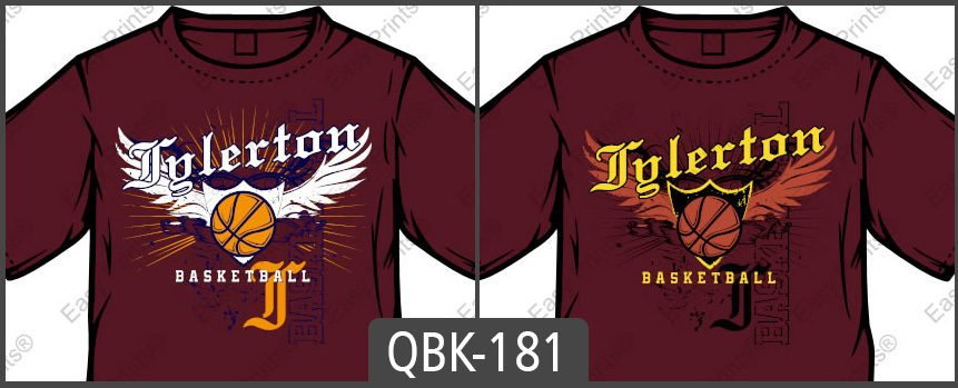
The same custom apparel design can be made to look completely different by simply changing or adding ink colors to the design.
In the image above, the only difference between these two t-shirt designs are the ink colors. In the left design, I used both navy blue and Tennessee orange in the background; creating a more exciting and noticeable background where the bright Tennessee orange really stands out. In the right design, all background elements are a dark black, making them much less distinguished, blending into the background. Also notice, that in the right image the wings and ball are the same color. The ball stands out more in the left image because the wings are made to look like a different element of the design since they are a different color. Though, the shield is more distinguished in the right design since it is different colors than both the wings and the ball.
Often times, your customers will tell you colors that they need worked into their designs. These are often schools or organizations that always use the same colors as part of their branding. When you want to add more colors to a set color design, black and white are great color fillers for both outlines and backgrounds. The image at the bottom shows examples that use both white and black in the designs.
Don’t forget to put cost into consideration when choosing your transfer colors. One of the pricing elements for our screen printed transfers is the number of ink colors; therefore, if you use less ink colors, you can easily lower the price of your transfer sheets. In the four colored image at the bottom of the page, the four colors could have easily been changed to three colors by changing the white ink used for the tiger’s eyes, nose, and teeth, to the gray color used in the background.
The number of ink colors that you use can affect the look of your design as well. One colored images can look great and save you a lot of money on ink costs. One of the noticeable differences between using one color and adding multiple colors to the design is that the different elements may stick out more with more color variety. For example, in the one ink colored t-shirt image below, the background stripes blend in more with the rest of the design than with the multi-colored examples.
Check out the images below and compare how different color combinations and adding more or less colors can affect the look of the same exact design. Don’t forget to consider ink colors the next time that you create custom apparel!


