The Easy View® Online T-Shirt Designer gives you the power to be your own artist for your t-shirt business without learning and owning expensive design software. With design layouts to get you started (Easy Prints®) you have the control to put your own creative edge and alter the layouts as you need to create professional artwork for your customer’s apparel.
With so many different tools within the Easy View designer, from text effects, to choosing fonts, to coloring the design, there’s so many unique ways you can alter an Easy Prints layout. Let these 5 design tips help you through the customizing and designing process to create professional artwork for your customer’s.
-
Limit Fonts
Using a lot of different fonts not only makes your design hard to read, but it’s also difficult to find fonts that look good together. The eye finds it hard to process multiple typestyles, so stick with no more than 2 fonts in your design.
-
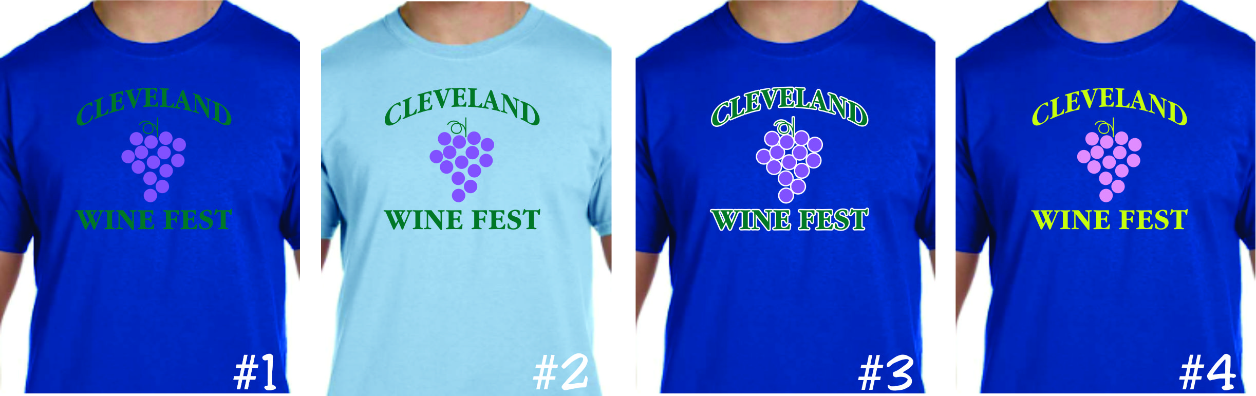
Use Contrasting Colors….or Don’t
Use contrasting colors to make your design pop out on the garment. If you want the art on your shirt to be very noticeable, then use dark ink on light colored shirts and light ink on dark colored shirts. However, if you’re going for a subtle tone-on-tone look, then you can ignore this rule.

- #1 has no contrast in the colors. #2 is the same ink colors as #1, but on a lighter shirt for better contrast. #3 is the same colors but with an added white outline for contrast. And #4 shows lighter colors, but with better contrast.
-
Don’t forget Artwork Guidelines
Pay attention to the Artwork Guidelines for printing, even when creating your design in Easy View®. Line thickness and Show-Through thickness guidelines are available and specified to help your design look it’s best when printed. When sizing your designs, make sure to keep in mind that small detail may look good on the screen, but when you apply the transfer to your apparel, the ink will expand causing that fine detail to not hold as well.

-
Color Placement
There’s a lot of variables when deciding what color will be placed where. Whether it be the actual ink color, or the color of the shirt that will show through in areas. Use the color placement wisely to help your design stand out. Even with one color designs, placing the colors in a certain way can make your design go from Meh. to Wow!
Inverted colors are one of the most common design mistakes and is not pleasing to the eye. Using inverted colors usually happens when the apparel color is changed to a dark color like Navy Blue and the clip art has the incorrect, natural color placement. In the original clip art, the areas that are Black should become the dark apparel color, and the areas that were white, should be the lighter ink color.

-
Use the Shirt Color in Your Design
Apparel with large, solid areas of ink will be uncomfortable to wear. When designing, Add areas where the shirt shows through the design. This will break up the ink areas and can also be used as another “color” in your design. Creating a design that is not a solid area of ink will create a softer, lighter garment decoration.
