
No, Shakespeare wasn’t really talking about custom transfer ink colors with the quote “A rose by any other name, would smell just as sweet’ but it does apply. Too often, it is easy to get caught up in the name of a color when what really matter is the color itself.
For example, if you want a bright pink color to be put on a black shirt, you may be drawn to the neon pink when our bubblegum pink would actually be a much brighter pink for the job.
Other colors that work better on dark colored shirts are yellow instead of neon yellow, orange instead of neon orange, mid blue instead of neon blue and celery instead of neon green. The colors with the neon name are very bright on white shirts or when a white outline is added to put on dark shirts, but alone are not the best choice.
Another color names that can be confusing is cardinal or scarlet—is a stop sign red needed (our red) or a light maroon (our burgundy) and khaki—is beige, natural or cream what you really need.
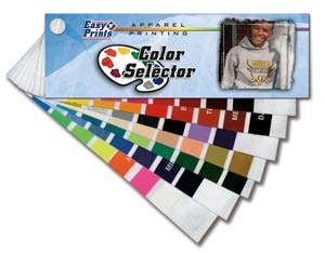
So how do you know? All of our colors that have a corresponding pantone match are listed with this number. So if you have a Pantone chart the chart can be used. An even more useful tool is our ink color selector. This is a “paint strip” like chart showing all of the actual colors so the name really won’t matter at all.