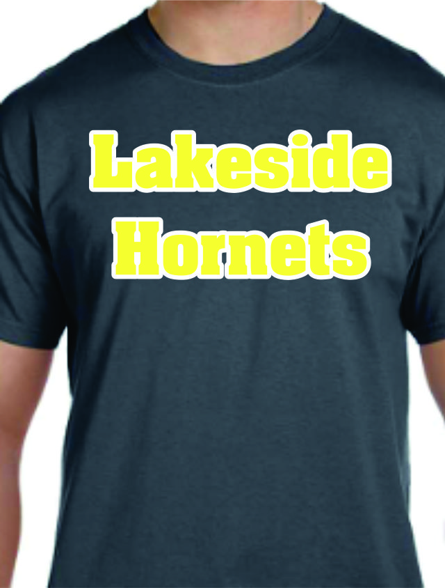
Have you ever heard of the concept tone-on-tone? It’s the idea that you are decorating a garment with a color that is virtually the same as the color of the garment. For example, you’re putting black screen print on a black shirt. The idea is that the contrast is not high, but the texture and shine are different. We see this concept popping up more often these days – even Ted Stahl mentions the idea here in his blog on Heat Printing Predictions for 2014. It’s an interesting idea that can really make a garment look unique… but only if that’s what you were trying to do. When the tone-on-tone look happens accidentally, it can be very problematic for you. Have you ever had this happen before? A great example of a bad idea: yellow and white. If you take a yellow line of text and put a white outline on it, you probably have good intentions (trying to keep the yellow bright, trying to make an eye catching design, etc…). But these colors have no contrast.

Contrasting colors are defined as colors that are from different segments of the color wheel. For example, orange is from the “warm” section of the color wheel and blue is from the “cold” section of the color wheel. Consequently, these two colors contrast each other. When planning your design you want to ensure that you’re using colors that contrast one another. Otherwise you get results like those above: two colors who are so similar that from a distance, you can’t even tell what it says! And as the garment decorator you have two things to keep in mind: #1 – Making sure your ink colors contrast your garment. And #2 – making sure your ink colors contrast each other (if you’re doing multiple colors). Using the above example again, we made sure that the garment color contrasted the ink – dark grey is much different than yellow and white. But we should have advised our customer that yellow and white DON’T have a lot of contrast. They’re both warm colors, and are bright. So what should we have done? Consider choosing something darker than yellow. Our gold is about the shade of a school bus, and it contrasts much better with white. Have a hard time describing the color to your customer? We have you covered there too. For $20 we sell our Color Selector. This professional flip book shows you an actual screen printed sample of every color we carry. So there’s NO question about if “Gold” looks more like a school bus or more like a sunflower.

Let’s glance over the above examples. On the surface, the idea of purple and green going on blue doesn’t sound bad… they’re sort of complimentary colors, right? It’s not like you’re using three shades of blue after all… right? Example #1 shows you our standard purple and dark green on a medium blue shirt. And as you can see, the contrast isn’t very good. Technically all three colors are “cool” colors which isn’t a big deal necessarily, except they’re all about the same tone – medium to dark. So there isn’t enough contrast to make the colors pop. On example #2 we’ve used the exact same color inks but we’ve put it on a light blue shirt instead of medium blue. The purple and dark green contrast the light blue because they are both medium to dark colors. Maybe your garment color cannot change though… then what? #3 shows you the same two colors, but with a white outline around the text and clip art. Technically the white is a high contrast to both the garment color AND the ink colors because the white is so bright. It’s MUCH easier to see and read then #1, but now you’ve made your transfer a three color design (in this example). So lastly #4 shows what could be the best course of action. We’re using lavender and celery instead of purple and dark green. Lavender and celery are both light colors that contrast against the medium blue and you didn’t have to change your shirt color.

One last point here – tie dye. This is one of those fads that never seems to go out of style. And now that wholesalers like Alpha Broder are selling a variety of these garments, it’s not going to go away any time soon. I find that a lot of decorators first reactions are to use white when they decorate tie dye. And this isn’t the best idea. Not because of bleeding – our white would certainly stay bright. But because even the best tie dyed garment will fade over a period of time. And sooner or later that shirt is going to start showing some of the original white. Once that happens, you’ve got white on white. If you use black, however, and go out of your way to make sure the shirt doesn’t have any super dark colors, what you’ll have is a garment that can be worn even after the dye begins to fade.
So in the end, even when your customer seems positive that they really want dark green shirts with maroon ink… it’s a good idea to make sure they understand contrast and that what they get might not be what they’re imagining!