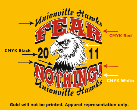
When creating custom artwork for screen printed transfers, color placement is important. The screen printing process uses spot colors. You can use spot colors when creating art, but it is not required. However, you should use consistent colors in your file.
Here are some guidelines for color placement in your custom art:
- It doesn’t matter if you use a spot color, a CMYK value, or an RGB value as long as it is the same throughout. So if you use CMYK values, use CMYK throughout your whole file.
- Use the same color to represent each color in your design. For example, if you have a blue area, use the same blue for all those blue areas.
- If it helps to add a background color to match the apparel color, go ahead and try that. This helps if you are using a white ink as one of your colors and want to distinguish the ink from the background or show-thru areas.

Colors appear differently on different computer monitors. If you would like a more accurate idea of how your colors will look when printed, use one of our Color Selectors that are part of our marketing kit or available separately.
A good spot color palette to use in Adobe Illustrator® and CorelDraw® is the “Pantone® solid coated” palette that comes with the software.