If your customer is looking for a soft custom transfer, the key is not the product choice but rather the artwork. A large amount of plastisol ink on your shirt will be heavy regardless of the product choice. Instead, use the shirt color in your design to lighten up the print, making it lightweight and giving a softer feel.
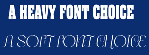
1. Font Choice: Large bold text requires more ink and gives a heavier feel. Choose lighter fonts for a soft, lightweight feel. If you read the news, you might have seen the story where a 14 year old teen said he could save the government millions of dollars in toner cost if they would use a lightweight font over the heavier, more common Times Roman font. The same is true with screen printing. Less ink leads to a lighter, softer feel.

2. Outline Text Effect: An outline letter will give a much lighter, softer feel for the same solid font because there is less ink.

3. Show Thru Areas: Finally, when creating art, incorporate the shirt color in the design and avoid large masses of ink.
